Juxt
JUXT Design
Index · Tags

design system

26 items tagged with design-system.

Blog Posts(6)

  • ArticleJanuary 25, 2025

    Why OKLCH matters for designers in 2025

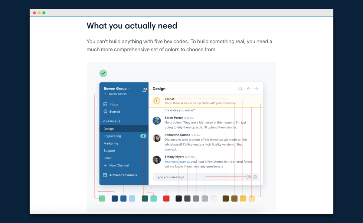
    Last week, TailwindCSS released their v4 version with revamped color tokens using OKLCH. I forsee more web devs are going to adopt OKLCH as the new standard for color tokens. This might sound very technical, but it's actually a significant change UI/UX designer should be aware of. With major browsers now reaching 93.1% adoption rate, OKLCH is on track to be the new standard that bridges design and

    ColorDesign SystemTailwindcss
  • ArticleSeptember 10, 2026

    Designing for iPhone Duo

    Apple’s first folding iPhone asks teams to keep one adaptive app across poses and two displays, not invent a separate “foldable mode” per hardware state. Size, aspect ratio, and which face is active will keep changing. The design brief is coherence. Start with Apple’s own material: iPhone Duo for developers, HIG: Designing for iPhone Duo, and the tech talks Design for iPhone Duo, Raise the bar, an

    IosDesign SystemHuman Interface
  • ArticleJanuary 25, 2025

    設計日報 2026-05-31

    週末打開設計圈,AI 的話題不在「更強」,而在「品味」這件事上 ➡️ 1️⃣ Anthropic 推出 Claude Opus 4.8——主力模型再升級,AI 協作的生成品質再上一階。改稿、發想的天花板又被推高。 2️⃣

    ColorDesign SystemTailwindcss
  • ArticleAugust 14, 2026

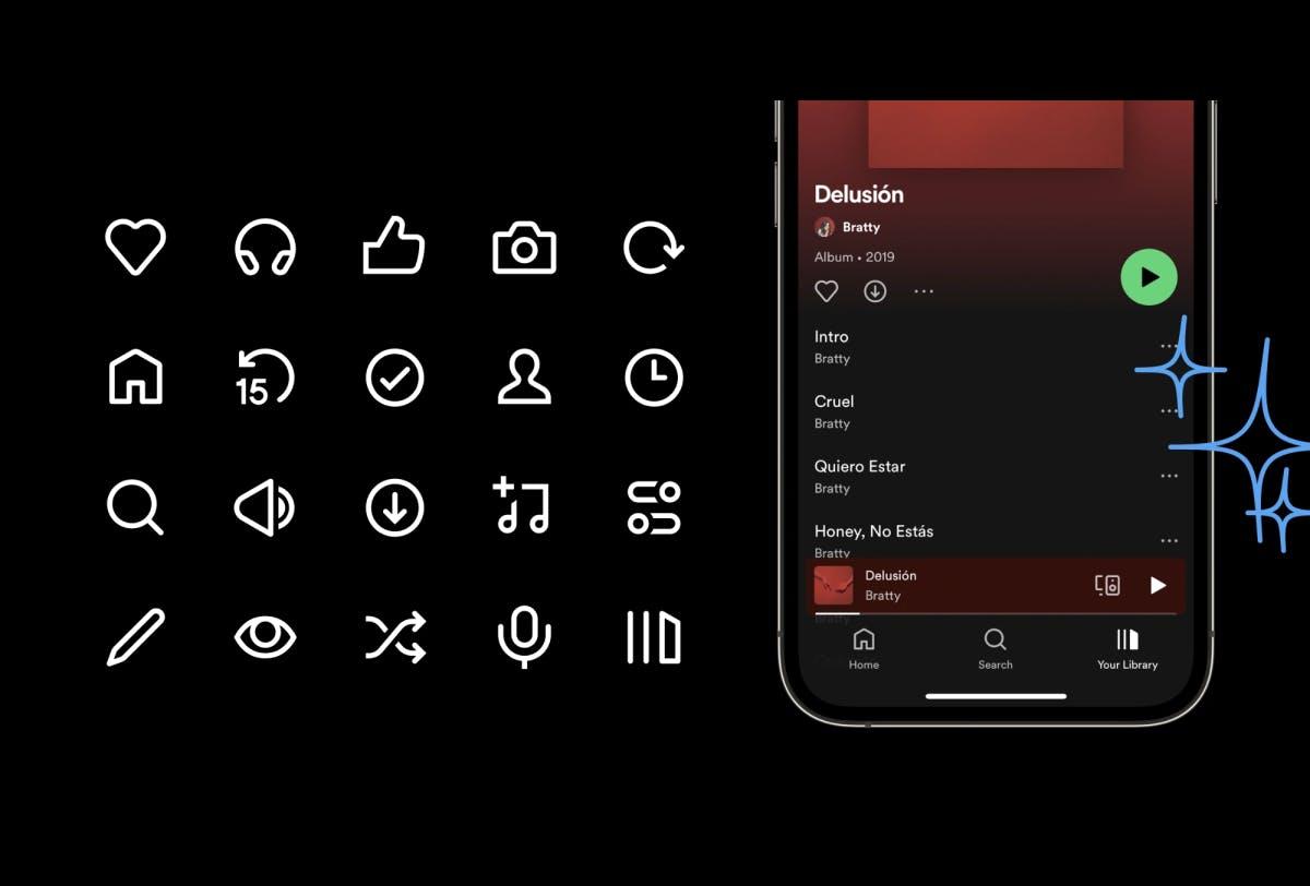
    Cursor 的新圖示,不只是換皮

    很多產品的 icon 都是這樣長出來的:先借一套現成的,之後缺什麼就補什麼。久而久之,同一個產品裡會出現幾種不同的線條、圓角和比例。每一個 icon 單獨看好像沒什麼,但放在一起,就會有一種「不是同一個人畫的」的感覺。 Cursor 最近換上了一套全新的 icon system。Minor Adventures 的設計師 Marek Minor 在一篇文章裡分享了整個製作過程:大約一年、600 多個 icon、兩種尺寸、兩種風格,而且每一個探索和最後版本都是手工繪製。 這件事最有趣的地方,不是 Cursor 的 icon 變漂亮了,而是它示範了一個成熟產品如何把視覺細節變成可以長期運作的系統。 ⸻ ▍從「繼承」走向自己的語言 Cursor 最初沿用了 VS Code 的 Codicons,再加上一些不同時期慢慢累積的 custom icons。這很合理,產品早期最重要的是先把功能做出來。但

    CursorDesignDesign System
  • ArticleSeptember 4, 2026

    真正的影響力,是讓品味變成預設 — 讀完 Fey 被 Wealthsimple 收購一年後的回顧,我一直在想:創辦人對 UI 跟工程的 synergy,不是交接順暢,而是同一套判斷同時改兩邊。

    Dennis Brotzky 寫了一篇 Wealthsimple 收購 Fey 一年後 的回顧。三個一起做了十多年產品的人,走進一家幾千人、高度監管的金融公司,然後開始改網頁。 很多人會把它讀成一篇 performance 文章:Angular shell 拆掉、prefetch、字體 cache、logo 不再一張一張問 GraphQL。這些都很硬、也很精彩。但我讀完最卡住的,不是速度變快,而是這件事: taking Thiago's taste and making it the default for the rest of the company. 把一個人的品味,做成全公司的預設值。 這句話把創辦人對 UI 跟工程的影響,講得比「創辦人很注重細節」準很多。細節人人都會講。真正稀缺的,是同一套判斷同時改畫面、改 code、再改系統,讓後來的人不用認識你,也會做出你會認的東西。 ⸻

    DesignEngineeringDesign System
  • ArticleSeptember 10, 2026

    為 iPhone Duo 設計 — 控件外移、避開折痕、可縮放版面:讓同一個 App 在 Duo 的多種姿態與雙螢幕上仍保持一致。

    Apple 第一支摺疊 iPhone,要的不是為每種硬體狀態另做一套「摺疊模式」,而是讓同一個 App 在姿態與兩塊螢幕之間自適應。尺寸、長寬比、哪一面在作用都在變時,設計目標仍是:體驗像同一個產品。 先看官方材料:iPhone Duo for developers、HIG:Designing for iPhone Duo,以及技術講座 Design for iPhone Duo、Raise the bar、Multiple displays and scenes。 把 Duo 當成同一產品的多種姿態。優先用系統的 size class(compactregular)、layout margins 與 safe area insets,不要為每個姿態各做一套自訂版面。若某個姿態必須特製,也要維持階層與導覽語言一致,讓它仍像同一個 App。 控件往外緣靠,好保住垂直內容高度。裝置摺起時,內容

    IosDesign SystemHuman Interface
  • Resources(20)