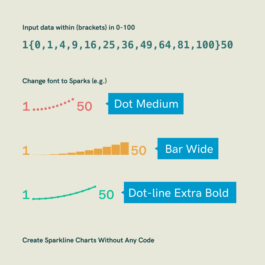
Sparkline is a tiny chart to visualise trends of a series of data values. After The Flood created Sparks font to generate sparkline chart using a line of text, no Excel or any design software is required. Therefore you can use it anywhere, like Powerpoint, website or basically anywhere you can think of.
How does that work?
Sparks used OpenType’s context alternative feature to create a dot that is proportionate to the values that you typed in. For details can be found from their Github. Simply use {} to contain your values and , to separate your values. Mind that you should be using integers from 0 to 100.
How can I customise?
There are 3 chart types that you can choose from Sparks - Bar, Dot, and Dotline. Each of them has 5 variations in different widths.
How to download?
The official website is down already, but you can download the font from their Github page.